
Sleazy Comic Catalog
July.2019
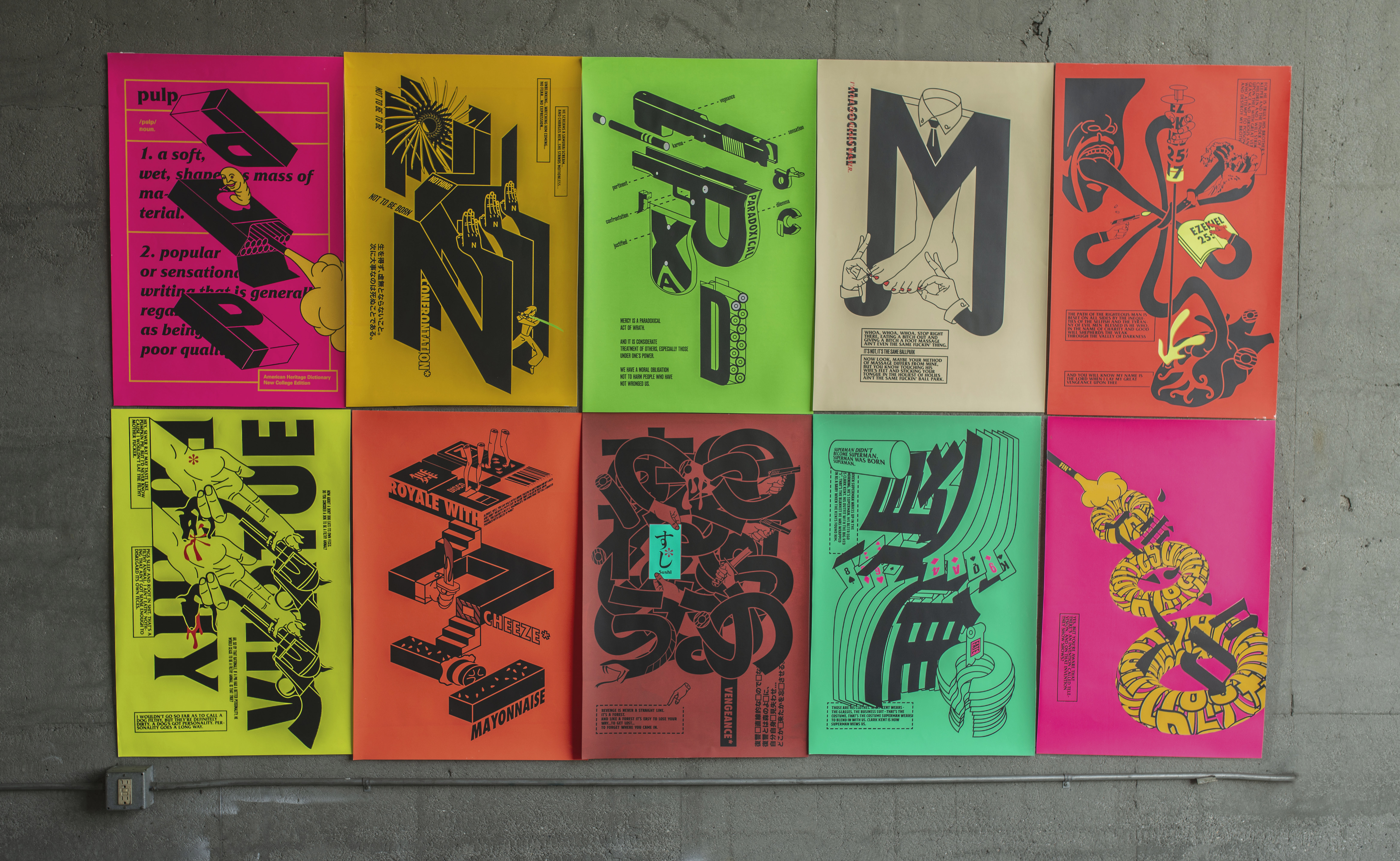
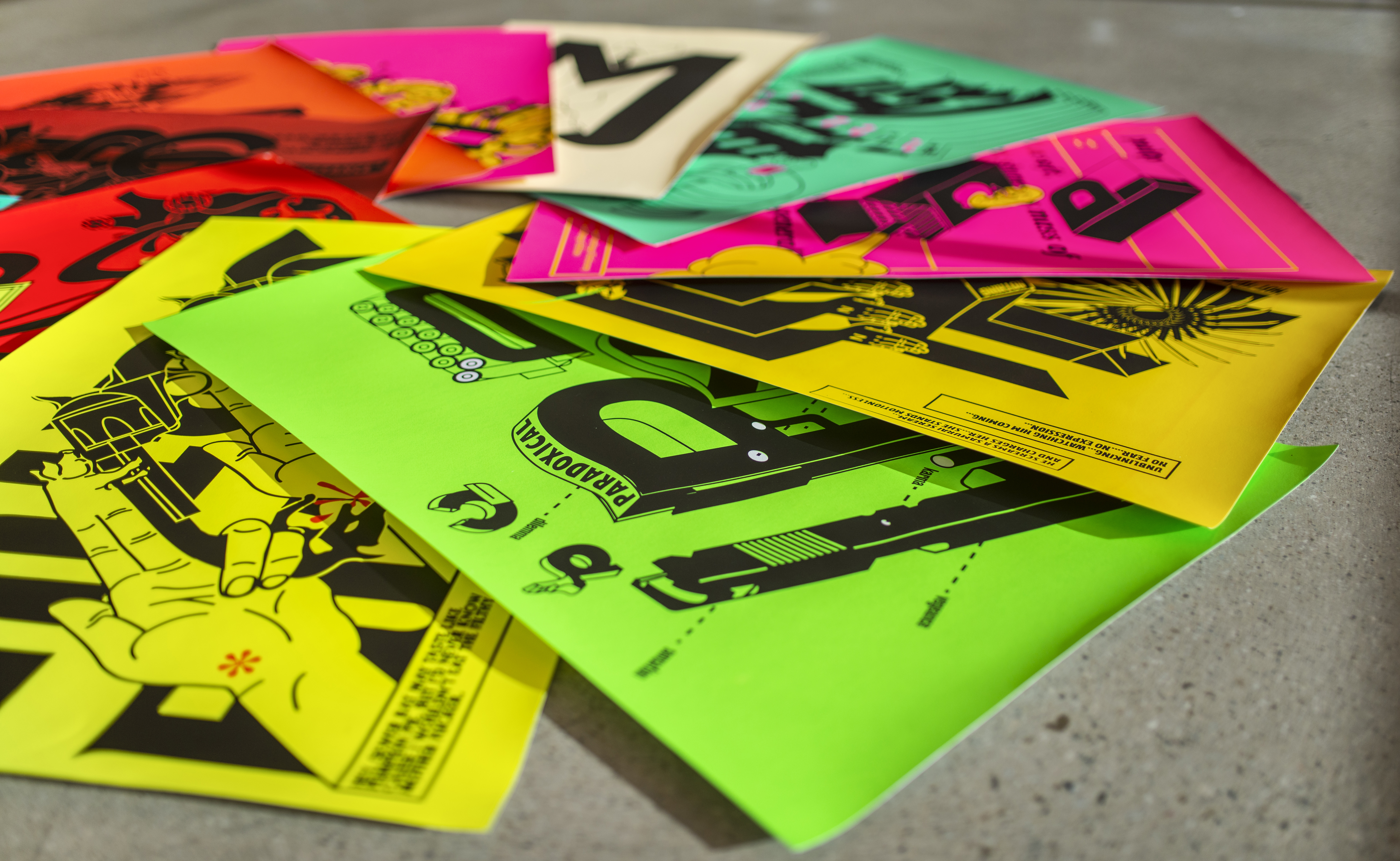
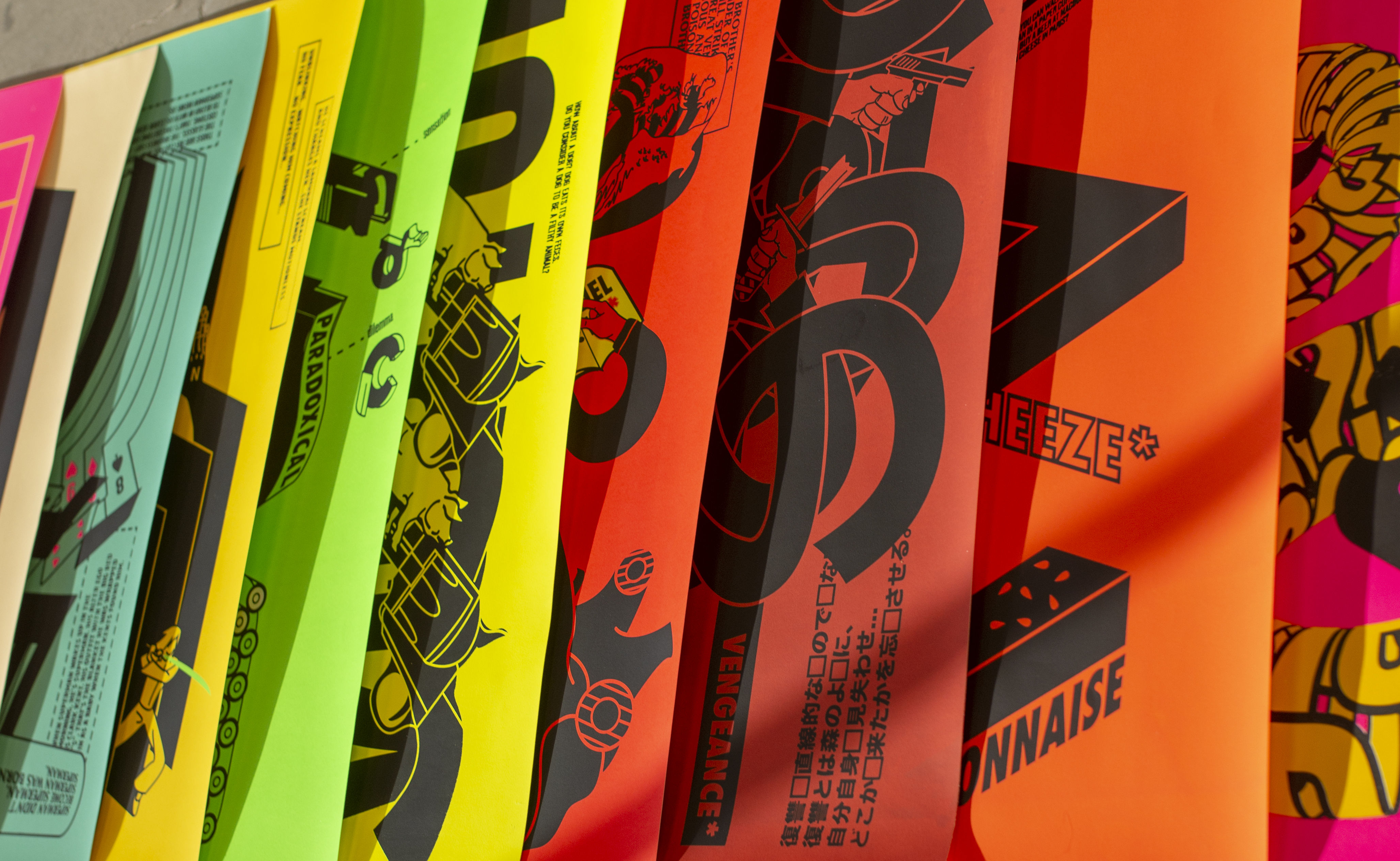
The poster series and media works collection, Sleazy Comic Catalog, was designed to use an experimental typography approach to demonstrate Quentin Tarantino’s cinematic narrative philosophy. The title of the collection was inspired by the dictionary description of “pulp” in the film. Like Tarantino’s movie, the narrative of the poster series is non–linear and unexpected. Endless illustration and typography transitions mimic his theory of random destiny to challenge the audience. The final production for the poster series was screen printed to enhance visual impact.
The typography animation and interactive mural are extensions of this subject matter, applied with the same concept and frame–by–frame animation. Due to respects for Tarantino and his work, a specific identity was not given to the project.
Printed by:
Press Friends LA
Special Thanks to:
Tyrone Drake, Miles Mazzie and Ivan Cruz
Recognization:
Type Directors Club 66: The World’s Best
Typography in Communication Design
Typeface in Use:
Futura Condensed Extra Bold,
Druk Super Condensed, Friz Quadrata
S
Gallery:


Animation With Sound 1:
Animation With Sound 2:
Interactive Mural Animation :
Interactive Mural (Kinect Sensor) :
Catalog:
Awards:
Feb.2020
Certificate of Typographic Excellence
for Communication Design
Type Directors Club (TDC), New York
Nov.2019
Leah Hoffmitz Milken (LHM) Scholarship
for Letterform Design
The Hoffmitz Milken Center
for Typography (HMCT),
ArtCenter College of Design, Pasadena
May.2019
Typography Excellence for Poster Design
The Hoffmitz Milken Center
for Typography (HMCT),
ArtCenter College of Design, Pasadena
May.2018
Financial Aid for Scholarship review
Graduate Graphic Design Department,
ArtCenter College of Design, Pasadena
Shin G.
Is a type designer recently completing a master’s Graphic Design program at ArtCenter College of Design. In addition to designing typefaces, I do enjoy variable things in my life. I enjoy reading, writing, calligraphy, cooking, leather goods and vintage fashion. These habits help me with aesthetical and logical senses outside the world of letterforms. Working on typefaces makes designers’ thoughts organized and rational, but will not blind our vision. I have always been on adventures exploring challenging typography tasks, like interactive typography and multilingual typeface design. I am looking forward to a larger stage for my typefaces and my research and meeting insightful people from all industries.